Overview
Humber Baking Co. is a brand concept and web design project for a fictional artisan bakery, developed during digital design studies at Humber College. The brief was open-ended: create a complete brand and digital presence for a small food business that could credibly compete with established artisan brands.
The result is a warm, photography-driven brand with a hand-crafted aesthetic, a conversion-optimized product flow, and a design system that scales from a business card to a full e-commerce product page.
Brand Direction
The Humber Baking Co. identity leans into imperfection as a quality signal. Where mass-market bakeries trend toward clinical cleanliness, this brand uses irregular textures, hand-drawn logotype elements, and warm off-white backgrounds to communicate that something made with care looks different from something made at scale.
The colour palette is built around baked goods: wheat gold, toasted brown, and a soft sage green as an accent. These colours work together across print, packaging mockups, and digital without needing adaptation.
Web Design
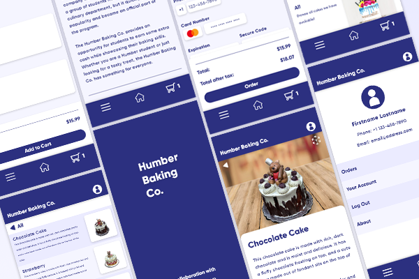
- Photography-driven homepage with hero, featured products, and brand story sections
- Product listing page with filter by category (bread, pastry, seasonal)
- Individual product pages with ingredients, allergen info, and add-to-order flow
- Conversion-optimised checkout flow reduced to three steps
- Email capture with a lead magnet (free recipe download) above the footer
- Fully responsive from 320px mobile to 1440px desktop
Conversion Design
The product pages were designed with purchase intent as the primary constraint. Social proof (review counts, a “most popular” badge) sits directly adjacent to the add-to-order button. Allergen and ingredient information is collapsed behind a disclosure to keep the primary action visible without hiding important details.
The cart experience was simplified to a persistent side drawer rather than a separate page, so customers can continue browsing after adding an item without losing their place in the product catalogue.
What I Learned
This project was an exercise in the gap between aesthetic quality and commercial effectiveness. A beautiful restaurant menu layout works because browsing is the goal. A product page for a bakery requires different design priorities: trust signals, clear pricing, low-friction ordering. Aligning those commercial requirements with a handcrafted visual language was the central design challenge.