Overview
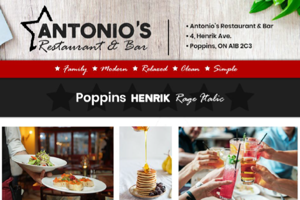
This project was a brand identity and digital presence concept for Antonio’s Restaurant, a fictional upscale Italian dining establishment. The brief called for a design system that felt premium and rooted in Italian culinary heritage while remaining approachable and functional across every touchpoint.
The deliverables included a full visual identity, typography system, colour palette, and a responsive website designed in Figma and built as a live coded prototype.
Brand Identity
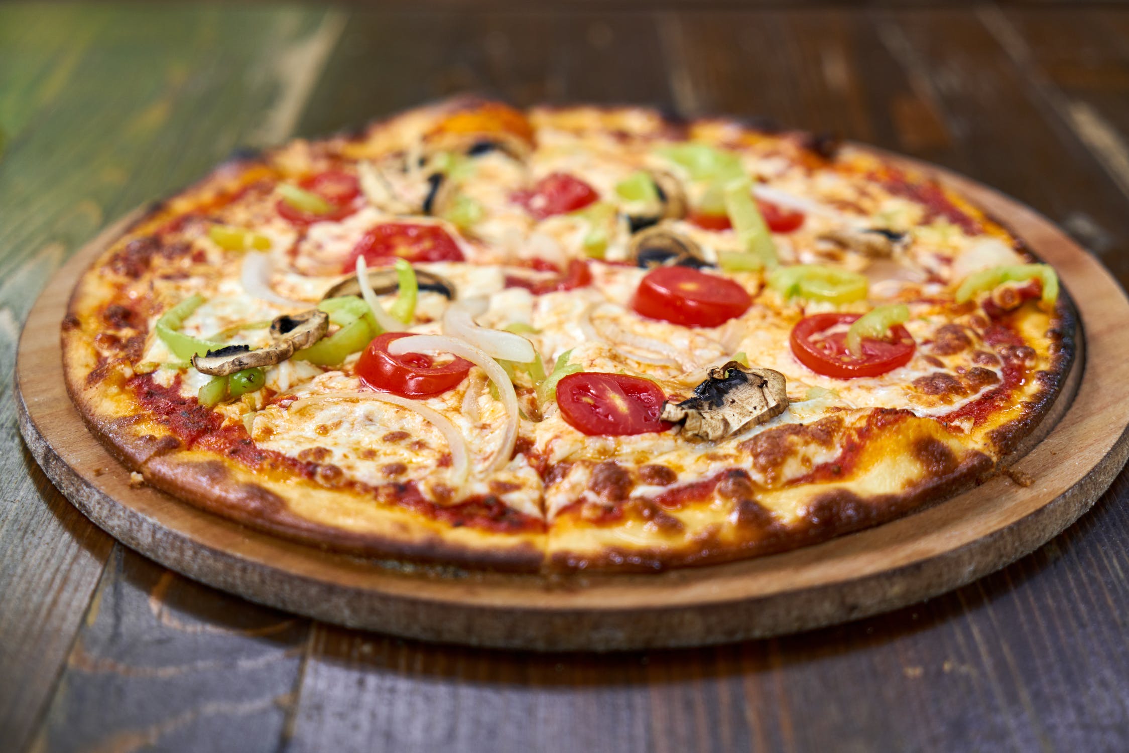
The identity was built around three pillars: warmth, heritage, and craftsmanship. The colour palette uses deep terracotta, warm cream, and forest green to evoke the colours of an Italian countryside kitchen without resorting to cliched red-and-white checkered imagery.
Typography plays a central structural role. A high-contrast serif is used for headings and menu items to convey quality and tradition, paired with a humanist sans-serif for body copy and UI labels to maintain readability at small sizes and on screens.
Web Design
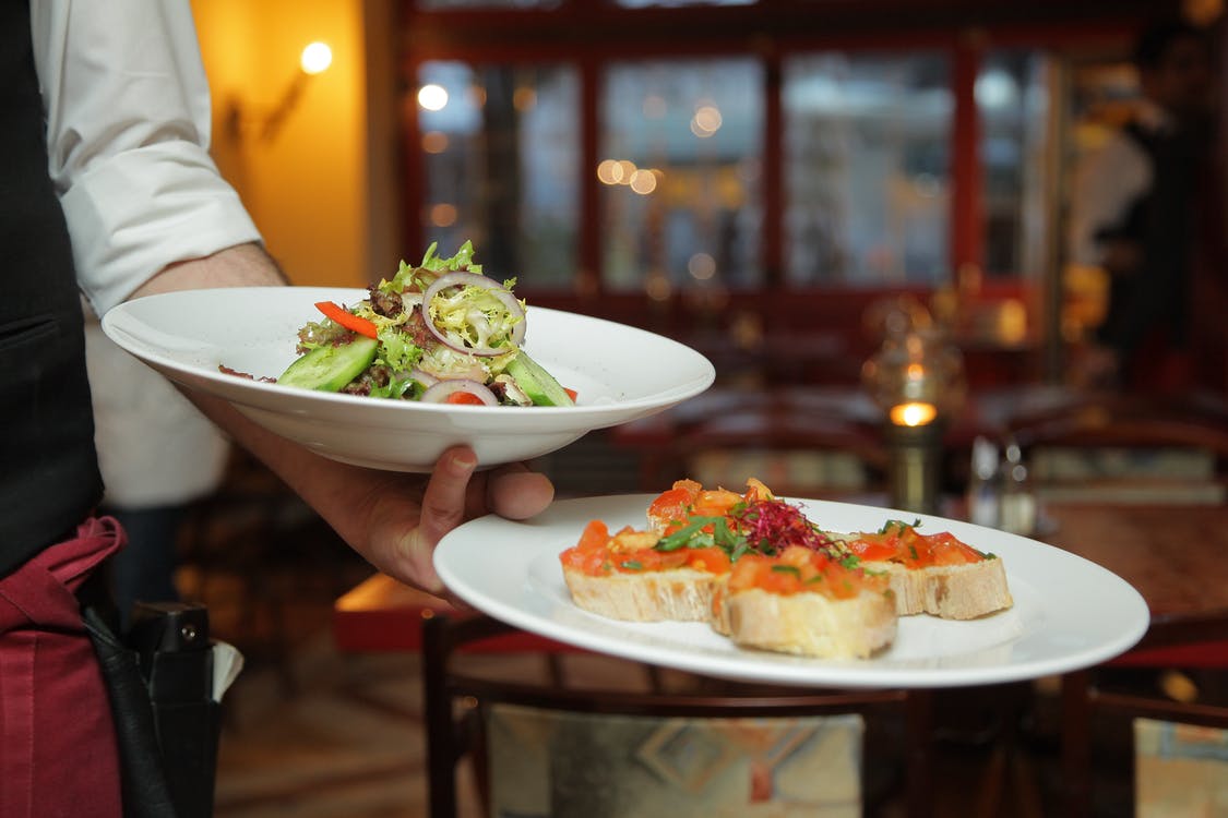
The website was designed with a content-first editorial layout. The homepage opens with a full-bleed hero photograph and a sparse headline, letting the food photography do the primary persuasion work before any copy appears. Navigation is minimal and fixed, never competing with the visual content.
- Full-bleed editorial hero with parallax scroll effect
- Structured menu layout system using CSS Grid for alignment across courses
- Reservation CTA integrated into the header on scroll to reduce conversion friction
- Story section with alternating image and text rhythm for narrative pacing
- Mobile-first responsive implementation with fluid typography
Menu System Design
The menu layout was a specific design challenge. Restaurant menus online frequently fail because they either present a scanned PDF or use an unstructured list that loses the hierarchy of a physical menu. This design uses a CSS Grid layout with explicit columns for dish names, descriptions, and prices, maintaining visual alignment across every item without a table element.
Outcome
The project was developed as part of digital design studies at Humber College. The final deliverable included a Figma design system, an annotated prototype, and a coded live build. The work demonstrated the ability to translate a brand brief into a cohesive digital system across identity, layout, and interactive components.
