Overview
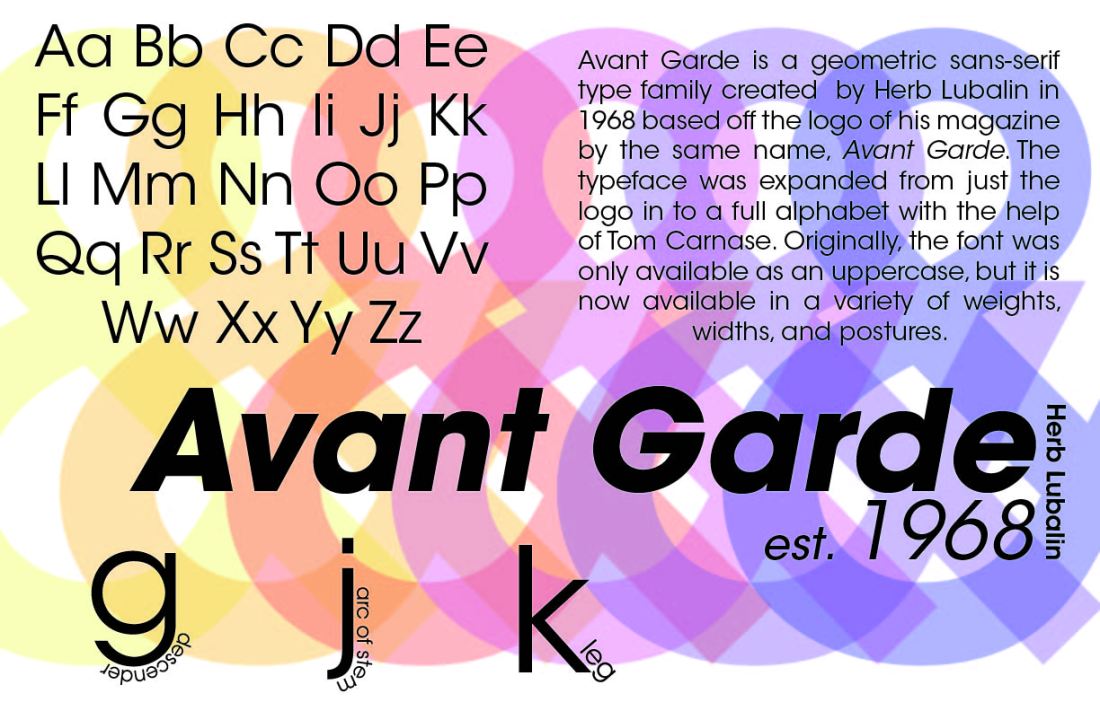
This project is a type specimen poster designed to showcase the complete typographic range of a single typeface. A type specimen is both a demonstration and an argument: it makes the case that a typeface is expressive enough, legible enough, and versatile enough to carry a visual identity on its own.
The deliverable is a large-format print piece designed on a strict modular grid, prepared for CMYK offset printing at 600 DPI.
Design Approach
The poster is structured as a sequence of typographic demonstrations, each occupying a defined zone on the grid. The hierarchy moves from macro to micro: a large display setting at the top demonstrates expressive potential, a range of weight specimens across the middle demonstrates versatility, and a body text sample at the bottom demonstrates legibility at reading size.
Every element on the poster is set in a single typeface. No supporting typefaces, no icons, no photography. The constraint forces the design to rely entirely on weight contrast, scale variation, tracking, and spatial arrangement to create visual interest and hierarchy.
Modular Grid
The layout is built on a 12-column, 16-row modular grid with consistent gutter widths derived from the typeface’s em square. The grid is not rigid: columns and rows are combined into larger modules for the display settings, and the baseline grid ensures that body text aligns across columns even when column widths differ.
- 12-column grid with em-derived gutters for typographic consistency
- Baseline grid alignment across all text elements
- Display settings at 120pt, 72pt, and 48pt demonstrating scale range
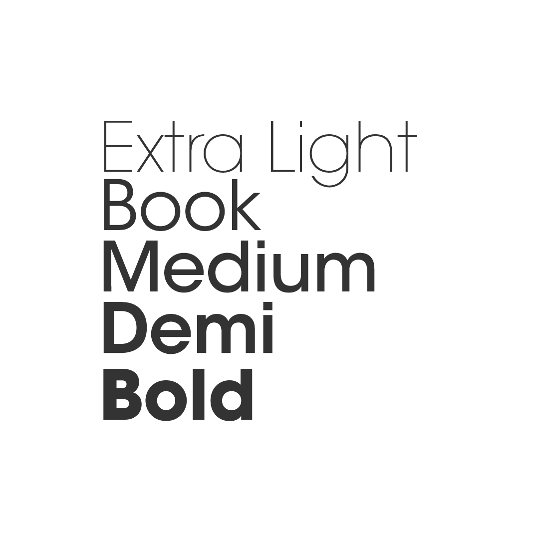
- Full weight spectrum shown in a tabular weight specimen section
- Italic and oblique variants demonstrated in context, not isolated
- Body text specimen set at 10pt/14pt to demonstrate readability
Print Production
The file was prepared for large-format CMYK output. All colours are defined in CMYK values, not RGB conversions. The black text uses rich black (C:40 M:30 Y:30 K:100) for the display settings and true black (K:100) for body text to maintain crispness at small sizes. Bleed marks and registration targets are included in the export.
What I Learned
Designing with only one typeface as the entire visual toolkit changes how you think about typography. Decisions that are usually made by switching typefaces, such as differentiating a label from a body paragraph, must be made through weight, size, and spacing instead. It is a productive constraint that develops sensitivity to the micro-details of typographic hierarchy.